.jpg)
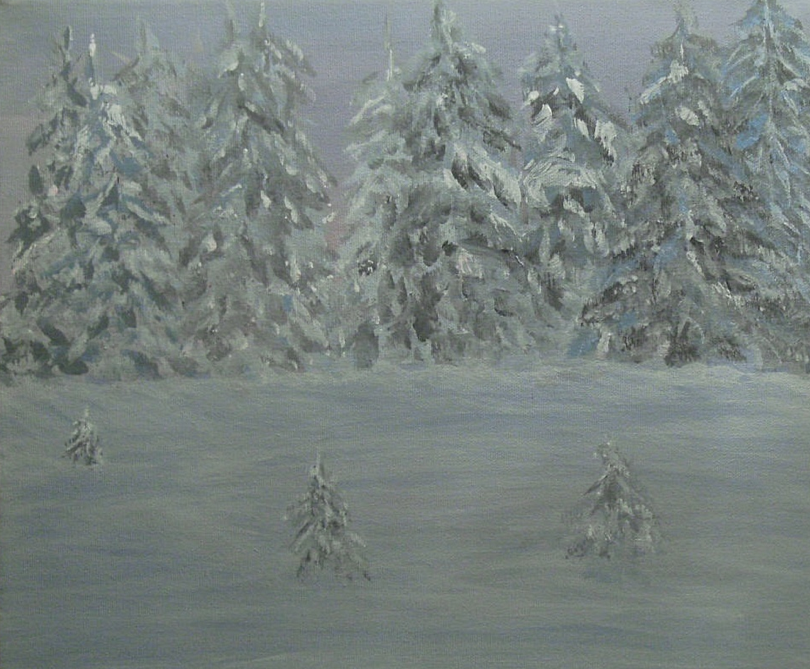
"Sunset at September Lake"
Acrylics/mixed media on Canvas
16" X 20"
Acrylics/mixed media on Canvas
16" X 20"
Every once in a while something good comes from a disaster.
The other day I was going through my
The other day I was going through my
"Paper53" app on my IPad and I was checking out my doodles.
(Things I have composed while watching TV )
(Things I have composed while watching TV )

I really liked the effect that the colours made when I would go to the next line down and continue a sky line.
The tone on tone created a wonderful effect, and I wondered if I could translate this
The tone on tone created a wonderful effect, and I wondered if I could translate this
small work to Acrylics on canvas.
I mixed up a watery (watercolour style) blue green for my sky and started.
I mixed up a watery (watercolour style) blue green for my sky and started.
needless to say I failed miserably!
So, here I was with a canvas covered in blue/white cloud like lines that did not work.
I did what any well intentioned Artist does in this situation, I grabbed a bottle of Fluid Acrylic
("Goldens Yellow Oxide")
and poured it over the canvas atop the blue/green mess!
and then I smoothed it over the canvas with a fine wide brush.
and poured it over the canvas atop the blue/green mess!
and then I smoothed it over the canvas with a fine wide brush.
and
VOILA!
I had the most gorgeous canvas in various hues of yellows and reds, and greens!
Now this was a canvas I could work with, and in colours I liked.
VOILA!
I had the most gorgeous canvas in various hues of yellows and reds, and greens!
Now this was a canvas I could work with, and in colours I liked.
I decided that somehow the sky would be of a Sunset.
So I needed a tree line.
And
And
then
I remembered
I remembered
that
I had just stocked up on Metal leaf.
Not just the regular Gold/Silver/Bronze leaf
but a new hue
that was
a Variegated Black.
I had never worked with it and needless to say, I was itching to work with this new colour.
I had never worked with it and needless to say, I was itching to work with this new colour.
It is a product put out by a company called
La D'ORE
and just gleamed.
So, instead of highlighting a painted tree,
I got the bright idea to paint the trees in with sizing and just use the leaf.
Different and kinda hairy because once dry, I would not be able to see what I had painted.
But, I persisted and ended up with this;
I got the bright idea to paint the trees in with sizing and just use the leaf.
Different and kinda hairy because once dry, I would not be able to see what I had painted.
But, I persisted and ended up with this;

Yes, that is metal leaf,
just photographed so as not to see the glare from the sheen.
And, I liked the results tremendously.
while I liked it, there was nothing defining the trees, so
And, I liked the results tremendously.
while I liked it, there was nothing defining the trees, so
again, I decided to draw trees "ATOP" the trees already there.
(again blind.)
I let this sizing dry and then layered Gold Leaf atop the black metal leaf and they looked wonderful.

Basically, not a good photograph, but this one shows the great difference between both colours of
the metal leaf.
I had depth.
And the contrast between the two colours was so pleasing.
I had depth.
And the contrast between the two colours was so pleasing.

I had a hard time deciding to do the lake in the front of the tree line.
would the sunset be behind the trees or in front?
Because the colour was so vibrant, I decided that the Sun would be behind the viewer.
The whole effect would be balanced with the reflection of the Sunset on the water.
The whole effect would be balanced with the reflection of the Sunset on the water.
so how to do that?
More metal leaf of course!
And that my friends
And that my friends
is how a disaster can actually turn out to be a pretty pleasing Painting!
Thanks for being here, I appreciate you taking the time to
Thanks for being here, I appreciate you taking the time to
read and view my blog so much!
~~Kathleen
~~Kathleen


.jpg)